Hello everyone!
A few months ago we started taking a close look at what buyers want. Today we will continue our quest 🙂
The goal is to not only take a look at the brief but also analyze why the logo matches the industry so well, so we can all practice that type of thinking :) We love asking those questions and believe that as our understanding of each industry gets deeper and deeper the better our logos and our sales would be!
When we work for a single client we have the privilege of listening to him, asking questions, taking notes etc. Our biggest challenge in the logo maker is that we do not know who our buyers are. So let's get started:
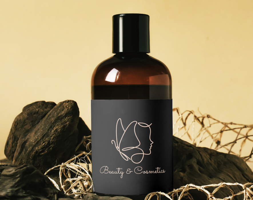
1.”Beauty & Cosmetics” by reve_line_ddi Industry: “Beauty & cosmetics” was chosen both by the seller and the buyer
Keyword in brief (buyer): black women, black men, men, hair, afro, character
Keywords on logo (seller): woman, butterfly, woman and butterfly, feminine woman, feminine butterfly, minimalist feminine woman
What made this perfect match possible?
“Beauty and cosmetics” industry and the tag “woman” were both chosen both by the seller and the buyer and so this is what got this logo into the listing in this case. It seems like the buyer was initially looking for a logo that has a black man or a woman with afro hair. Though we do have such logos in our system and he probably got to see some in the listing, the buyer chose to go with a delicate women’s face that is very gentle and inviting. This goes to show that although buyers think they want something very specific sometimes when they see our selection they take a different path.
Why does this logo match the chosen industry?
This logo matches the “Beauty & Cosmetic” industry because it is very feminine but not kitschy. It uses gentle free hand lines that create the shape of a woman's face with butterfly hair. It is both classy and minimalistic. The font looks as if the same hand drew it, and the black background has a sense of a chic modern boutique.
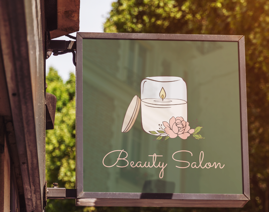
2. “ Beauty Salon” by Jmvo15
Industry: “Beauty Salon” was chosen in both the brief and the logo
Additional logo Industry (seller): Arts, Crafts & Sewing Stores, Crafts, Beauty & Cosmetics Blog/ Channel, Beauty & Cosmetics Products, Spa, Organic Beauty & Cosmetics products, Organic skincare, Celebrations, Weddings, Lifestyle Blog/Channel, Spiritual & Healing, Nail Salon, All Natural Makeup, Organic Makeup, All Natural Skincare, Events Decoration, Manufacturing, Death Care Services, Interior Design, Fashion & Apparel, Fashion Blog/Channel, Fashion Design
keywords in brief (buyer): hairspray, comb
keywords in logo (seller): candle jar, flower, leaf, flame, soy candle, candle maker, fire
What made this perfect match possible?
“Beauty Salon” industry is what made this logo appear in the listing. Although the buyer wrote “hairspray” and “comb” as keywords, this is not what he chose for the logo. The thing is that buyers often put keywords that are directly related to what it is that they do, but it does not mean that when they see them in the final design they would love what they see. The buyer ended up choosing a completely different element of logo and I think he made a great choice!
Why does this logo match this industry?
A Beauty salon is a place where individuals come in order to relax, get pampered, and invest in themselves. The candle and flower are both gentle elements that are calming and nourishing. You can almost smell the sweet smell of the candle and the flower. The logo is drawn with thin strokes and a calming color combination that fits the subject matter perfectly. The green and pink are a great color palette. The font chosen convery the same feeling as the object and together they are very inviting.
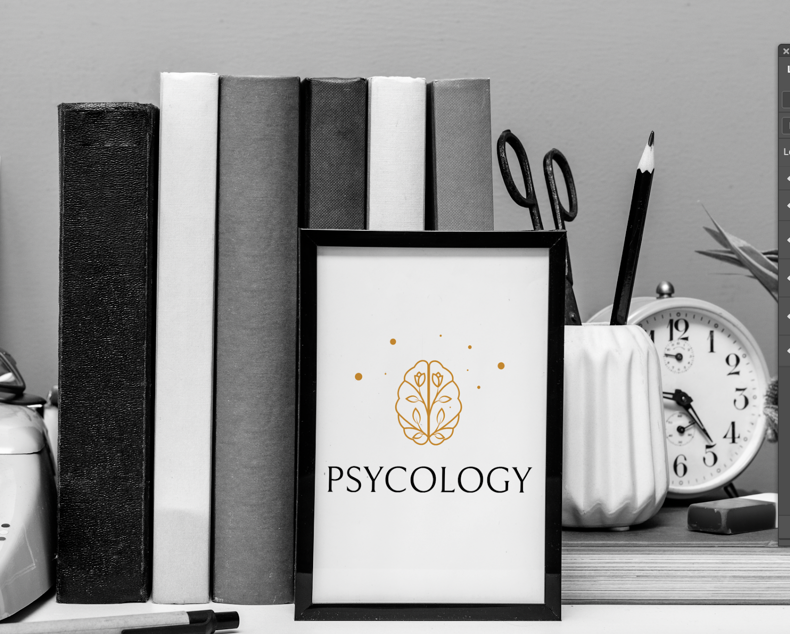
3. “Psychology” by umuarus
Industry: Psychology was chosen in both the brief and the logo
Keyword: “brain” was chosen in both the brief and the logo
Additional keywords in brief (buyer): leaf, growth, heart
Additional industry in brief (buyer): Food & beverage, food manufacturing
What made the perfect match possible?
The industry and keyword were both chosen both by the seller and the buyer and so this is what got this logo into the listing in this case.
Why does this logo match this industry?
Besides the obvious fact that psychologists treat the mind, the logo fits the industry because it is gently drawn with flowers and leaves inside the object, objects that suggest growth and development. The little dots around the brain add lightness to the composition as they float in space and almost look like little stars. The color chosen is calming and inviting, and the little dots around the brain
I hope you found these briefs helpful! I would love to hear your thoughts and suggestions


