
Education Content
September 17, 2024
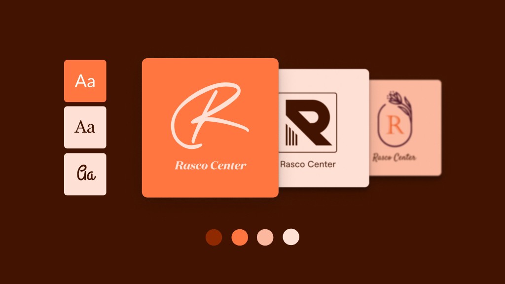
Logo Maker Tips and Tricks
# graphic design
# graphics
# brand
# branding
# professional branding
# Logo Maker
# logo design
The latest from the Logo Maker Team!

Hagit Marcus Bor
Hey Talented sellers!
Today I want to talk about highly popular symbols and the industries that need them the most. This is a great opportunity for you to design logos using common keywords with an industry in mind.
Those are highly searched and common symbols, and one would think, why don’t I create a logo using this symbol and just tag all the industries that they are searched in? It will increase my chances, right? Well, not always.
The same exact symbol should often look and feel completely different when taking the industry in consideration. A symbol can be gently drawn and pleasantly colored for one industry, and ruff and raggedy for a different industry.
In my eyes, that's what makes our job as designers more interesting and what differentiates us from just anyone!
So let's talk about 3 very common symbol and see how they differ:
1.Keyword: Heart
Ah, it seems like we talked a lot about matters of the heart (pun intended) but for some reason, it is so popular that it always seems that there is much more to say!
Heart / Fashion industries
In fashion, we have to differentiate between two types of businesses: kids clothing brands and adult fashion brands. While kids brands can be sweet and endearing, adult clothing brands should be cool and collected. Don’t go softly on us here. We want client to be intrigued, to feel attracted to the brand and the lifestyle that it offers, to want to be a part of the trend.
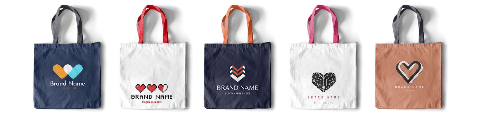
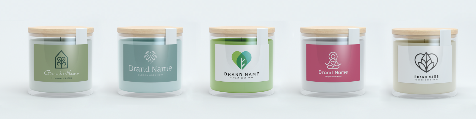
Heart / Health and Wellness
We talk a lot about the Health and Wellness industry a lot on this platform. We had a dedicated post just to this industry as it is so popular and is expected to grow even more in the next few years read the post here
How would a heart symbol be designed for the fashion industry? Since the main focus of this industry is “Wellness”- taking care of one's self, feeling better, indulging etc, the symbol should be simple, pleasantly looking and calming. No sharp edges or multiple colors here, we want to keep it simple and clean both in design and font selection.
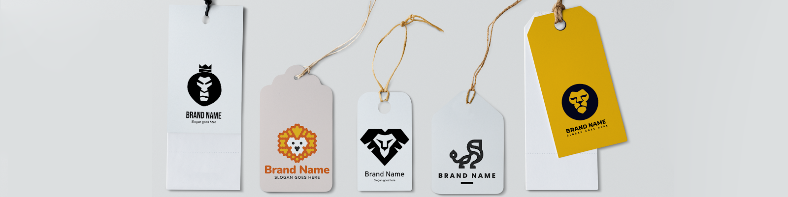
2.Keyword: Lion
Lion /Sport industries
The lion- the king of the forest! The strongest and scariest animal there is. There is no surprise that he is the most wanted animal in the sports industry. He represents power. Dominance, masculinity! He loves competition and he is always a winner. When designing a Lion symbol for sports and fitness, make him look strong, fearless, coregases! He should have a fierce facial expression. The logo can include other elements such as dumbbells, weights, but it is not a must.
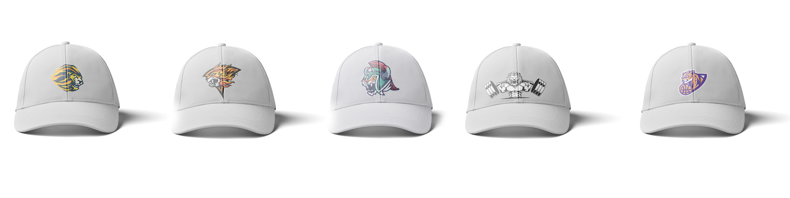
Lion / Fashion Industries
A lion symbol is great for fashion industries because he is a king. He is royal. He does not necessarily have to be portrayed as strong, but dominant and cool. The symbol should be clean and to the point. It can include other elements such as a crown but it is not a must.
That's it for today guys, can’t wait to see your amazing logos!
Hagit
Club Tip#12 21.2.24
Today I want to talk about one of my favorite topics:
What buyers want and what they bought! I always enjoy looking at the logos buyers bought, it always makes me so proud of our great designers and beautiful logos!
As we all know, buyers don’t always know what they want. Sometimes it is just after they see a logo they say “that's it!”, that's why understanding as much as we can about the industries we work with and tagging accurate industries and keywords is so important.
Let's look at some great examples, shall we?
A friendly reminder: we are not allowed to expose real business names and tags for legal reasons, so I won’t be mentioning them.
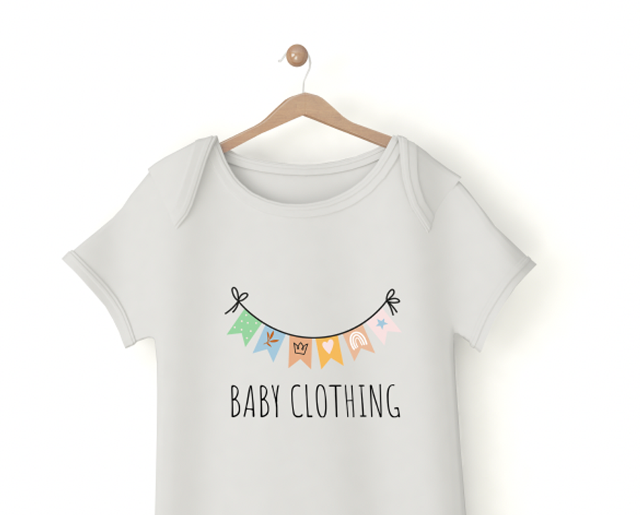
Industry: “Baby Clothing” was chosen both by the seller and the buyer
Keyword in brief (buyer): cat, crown, dog
Keywords on logo (seller):garland, decoration, kids, baby, heart, rainbow
What made this perfect match possible?
Baby clothing was tagged both by the seller and the buyer.
It is interesting to see that the buyer tagged “cat” and “dog” and went in a completely different direction. That goes to show that he needed us to point him in the right direction 🙂
Why does this logo match the chosen industry?
It is cheerful, festive and fun. I actually see a lot of kids stickers, greeting cards, bed sheets and other room decoration items that use birthday flags as a pattern. I think that the immediate connotation of a kid's birthday party brings up a smile on one's face and I imagine kids would be drawn to this logo.

Industry: “Financial Services” and “Banking” was chosen both by the seller and the buyer
Keyword in brief (buyer): no keywords
What made this perfect match possible?
I can not expose the business name, but I can tell you that it starts with a “T” 🙂 surprise surprise! Although no keywords were chosen by the buyer, the combination of the industries tagged in both and the T monogram made the match possible.
Why does this logo match the chosen industry?
Though the buyer did not know what keywords to enter, I think he made a great choice for a logo. A colorful logo is not an expected choice for the financial industry as logos in this industry are usually very traditional and not daring in any way. But I think that choosing a colorful, stylish, clean T is very clever. The two dots on the left side and the bottom adds sophistication and style to the logo. Although the color palette is uplifting and cheerful, it manages to not be childish in any way. The logo would not be confused as a logo for any kids related industry.
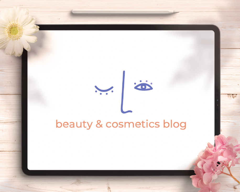
Industry: “Beauty and Cosmetics Blog or Channel” was chosen both by the seller and the buyer
Keyword in brief(buyer): face, bowl, colors, dish, flowers,plate ingredients, beauty, organic, skin, people,plant,roots, farm, simple,inclusive, community, conversation ,clean, readable, sunrise
Keywords on logo (seller): face, line, women
What made this perfect match possible?
“ Beauty and Cosmetics” and “face” was both chosen by the buyer and the seller
Why does this logo match the chosen industry?
Wow, I mean, wow- look at this long list of keywords! It is so rare that we see such a long list. The buyer was creative and willing to explore his options. It is interesting to see how he mixed objects (face, bowl, dish, flowers) with style (clean, simple) with parameters (readable, inclusive).
I love the logo he chose. It is not the obvious choice for the beauty industry. Logos for the beauty industry usually have a clean and feminine aesthetic to them. This logo does not have those qualities; it is not traditionally feminine, it is hand drawn in a sketchy style, it is imperfect, even childishly drawn. But despite all that, I think it works beautifully. It is daring to show imperfections in a beauty logo. It is eye-catching, simple and quirky. I am sure that this brand has an interesting philosophy behind it! I would definitely be intrigued to read the blog.
Great job reaching the end of the post! Now it's your turn to share your thoughts. What do you think about the examples provided? Are there any other insights you'd like to add? Share your thoughts in the comments below and let's keep the conversation going!
Comments (13)
Popular

Dive in
Related
Blog
Playful or Serious Logo? Tips from the Logo Maker Team
By Hagit Marcus Bor • Sep 17th, 2024 • Views 226
Blog
Playful or Serious Logo? Tips from the Logo Maker Team
By Hagit Marcus Bor • Sep 17th, 2024 • Views 226