
Education Content
December 1, 2024
Designing the Perfect Logo for the Evolving Fitness Industry

# logo design
# Logo Maker
# logo
# design
# graphic design
# creative
Logo Maker Alert: New Logos Needed!

Hagit Marcus Bor
The sports and fitness industry has undergone a significant transformation in recent years. Advancements in technology, evolving cultural trends, and a growing emphasis on health and wellness have redefined how fitness brands connect with their audience. As a logo designer, understanding these shifts is crucial for creating logos that resonate with audiences and thrive in this competitive market.
Industry Trends: Personalization, Technology & Accessibility
Gone are the days of one-size-fits-all. People are seeking tailored fitness solutions, from specialized studios to personalized training plans.
Check out these eye-opening stats about the sports and fitness industry:
- Fitness App Growth: The fitness app market is exploding, expected to be worth a whopping $14.7 billion by 2030! (Source: Grand View Research)
- Boutique Boom: Small, specialized fitness studios are popping up everywhere (up 121%!), showing people crave personalized workouts (Source: Exercise.com)
- Pandemic Fitness Equipment Surge: Fitness equipment saw a major surge during COVID19 lockdowns, especially yoga mats and stationary bikes (Source: Exercise.com)
- Home is the New Gym: The home fitness market is projected to hit $14.7 billion by 2028, proving people love the convenience of working out at home (Source: Exercise.com)
This all translates to one thing: fitness is all about personalization, technology, and making everyone feel welcome. Keep these trends in mind when designing logos for this exciting industry.
How Fitness Logos Are Evolving
Modern fitness logos are moving away from literal imagery and embracing minimalist, versatile designs that reflect motion, energy, and inclusivity. Here's a quick comparison of design trends:
ASPECT | THEN | NOW |
General Style | Literal imagery (e.g., dumbbells, running shoes) and detailed illustrations. | Minimalist, abstract symbols (e.g., swooshes, geometric shapes) reflect motion and energy. |
Target Audience | Generic, one-size-fits-all designs aimed at broad audiences. | Logos tailored to specific niches, emphasizing inclusivity and specialized services. |
Typography | Heavy, blocky fonts with minimal variation or creativity. | Sleek, custom fonts reflect brand tone, from modern to playful. |
Color Psychology | Limited palettes dominated by reds, blues, and blacks for strength and energy. | Vibrant, eco-friendly, or calming tones paired with gradients and dual-tone effects. |
Logo Adaptability | Static designs are optimized for print but are difficult to scale for digital platforms | Flexible, dynamic logos adaptable for mobile apps, wearables, and digital-first environments. |
Real-Life Examples
Take a look at recent logo redesigns to inspire your next batch of designs!
- Reebok:
Before:Detailed, performance-oriented log
After: Return to the simple, iconic Delta, circa 1990s, with a few tweaks. According to the brand, the new design has "a flattened top to create dynamic forward movement", "a stabilized base for better alignment and stronger balance" and "wider channels for better legibility at small sizes".
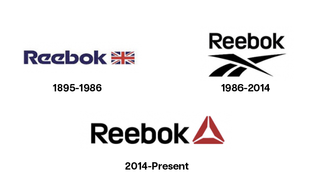
Source: DesignHill
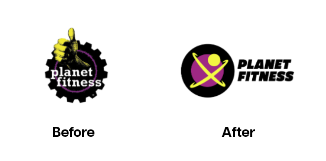
- Planet Fitness: Before: Older weightlifting imagery After: The "Judgement Free Zone" brand has modernized its logo, replacing older weightlifting imagery with a clean, inclusive thumbs-up design.
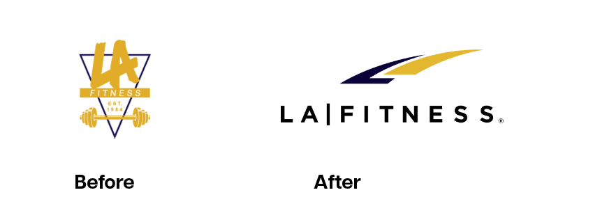
- LA Fitness: Cleaned up their logo to make it more versatile and appealing.
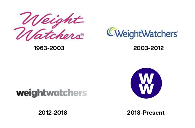
- Weight Watchers: Embraced a new, minimalist logo to reflect their focus on overall wellness.
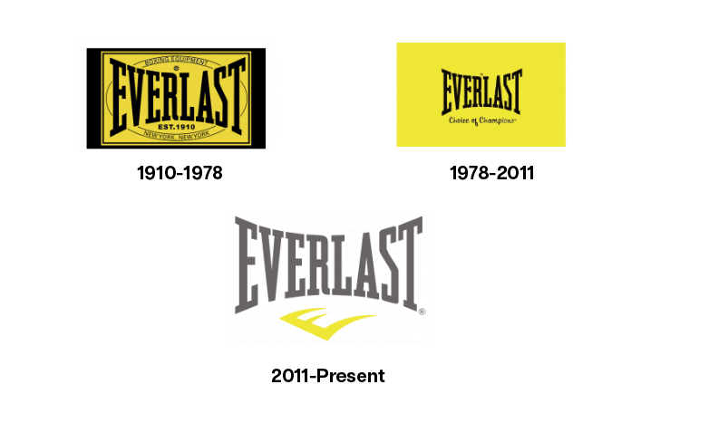
- Everlast: The font and letter size have not changed in 110 years; only the color palette and graphics have been revised, making it one of the most recognizable brands in the industry.
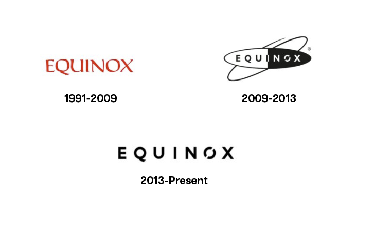
- Equinox: First simplified and modernized the font, and then got rid of the icon completely staying with simple and modern typography
These examples show that a great fitness logo is more than just a pretty picture. It's a powerful tool for helping a brand connect with its audience and drive growth.
Tips for Designing Fitness Logos Today
As the fitness industry evolves, so do the expectations for branding. Here are key tips to help you create logos that resonate with modern fitness brands:
- Understand the Brand Personality: Logos should capture a brand’s unique personality and vibe, meaning that the same option won’t work for a boutique wellness studio, a tech-driven fitness app and a performance-focused gym. For example, minimalist designs work well for sleek, modern brands, while more organic elements suit holistic-wellness brands.
- Prioritize Versatility: Ensure your designs are scalable and adaptable for digital and physical platforms. Logos today must look great on apps, wearable devices, gym walls, and social media
- But, Think Digital First: With the rise of fitness apps and virtual workouts, make sure your logo looks great on screens of all sizes.
- Feel The Emotion: Modern fitness brands often emphasize empowerment, inclusivity, and community. Use colors, typography, and shapes that evoke these emotions, helping the brand connect deeply with its audience
- Go Green: With eco-conscious brands on the rise, consider integrating natural elements, earth tones (like green, brown), and organic shapes to communicate sustainable values
- Keep it Simple: Less is often more. Avoid overly complex designs. Clean, simple logos are easier to remember and recognize.
- Be Inclusive: Fitness is for everyone! Create designs that are welcoming and avoid stereotypes.
The fitness industry is a dynamic, fast-evolving space, just waiting for designers like you to leave their mark. By familiarizing yourself with the industry’s trends (Rise of digital-first platforms, inclusivity, community and more) you can create logos that don’t just represent businesses, but connect with people and inspire them to give these brands a try. With these insights and strategies, you’re ready to help fitness brands stand out in a thriving market!
What do you think about these changes? Have relevant logos in your supply already? Remember to make sure they’re tagged with relevant search terms.
What industries would you like insights into next? Share in the comments below.
Comments (0)
Popular

Dive in
Related
Blog
Logo vs. Illustration: Exploring the Fundamental Distinctions
By Hagit Marcus Bor • Sep 7th, 2024 • Views 373
Blog
Playful or Serious Logo? Tips from the Logo Maker Team
By Hagit Marcus Bor • Sep 17th, 2024 • Views 165
Blog
Playful or Serious Logo? Tips from the Logo Maker Team
By Hagit Marcus Bor • Sep 17th, 2024 • Views 165
Blog
Logo vs. Illustration: Exploring the Fundamental Distinctions
By Hagit Marcus Bor • Sep 7th, 2024 • Views 373