
Education Content
September 7, 2024
Logo vs. Illustration: Exploring the Fundamental Distinctions

# Logo Maker
# logo
# logo design
Insights and tips from the Logo Maker Team

Hagit Marcus Bor
Hey, designers!
Welcome to the Logo Maker new design blog! It has been a long time since we posted but fear not, we are back.
So lets dive in to todays topic shell we?
We’ve all seen it: illustrations mistakenly referred to as "logos." As visually appealing or minimalist as an illustration may be, an image must transcend aesthetics to be a logo. Logos are about functionality, scalability, and encapsulating a brand’s essence.
Today’s forum will explore the key differences between logos vs. illustrations, with examples, and how to transform illustrations into impactful logos.
Logo vs. Illustration – Core Differences
Aspect | Logo | Illustration |
Purpose (The “Why”) | To identify a brand instantly. | Convey information, tell a story, or add visual interest. |
Intention | Capture a brand’s identity using simple visual elements. | Depict a narrative or concept, often with detail. |
Application | Brand-specific, but versatile and scalable, maintaining integrity across print, digital, etc. | Context-specific, more detailed, less scalable: books, articles, ads. |
Level of Detail | Minimal, simplified for clarity and scalability. | Intricate and complex, limiting their scalability. |
System Integration | Part of a broader brand identity system that includes things like color palettes, typography, and overall aesthetics. | Standalone or part of a narrative within a specific context. |
Practical Examples
Now that we understand the principles, let’s look at real examples. These illustrations aren’t “bad”—they are just not logos. Let's analyze examples to understand how each one functions more as an illustration, then see how we can transform illustrations into effective logos:
Why It's an Illustration — and How to Turn It Into a Logo
Illustration | Why It's Not a Logo | How to Turn It Into One |
 | Simple but too literal.Contains gradients which should be used sparingly, if at all, in logo design. Lacks symbolism. Not system-ready. | Abstract to geometric icon, remove shading, ensure single-color adaptability. Emphasize brand attributes such as strength, protection, or give context about the specific service provided (i.e., Construction company name) |
 | This is a scene of a woman sunbathing. Too complex, narrative-driven, lacks scalability. | Reduce to symbolic elements: sun arc, wave, minimal reclining figure. Emphasize brand elements: focus on spa, travel, wellness. |
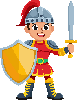 | Full character, expressive, too detailed to scale, more mascot than mark. Difficult to scale. | Simplify to a bold icon: helmet silhouette, shield, sword shape. Emphasize heritage, power, and strength. Focus on heritage, power, or strength. Make it stylized and system-ready. |
 | This is a scene of a truck and warehouse with gradients - it describes, rather than symbolizes. It’s gradients are too complex making it not scalable. | Create a flat, simple truck icon with motion or box elements. Avoid backgrounds. Focus on delivery, logistics. |
So, what are the key takeaways here for logo design?
- Symbolism Over Literal Representation: A logo should evoke a brand's identity, not just depict its products or service
- Scalability Across All Platforms: Ensure the logo remains clear and recognizable at any size, from website favicons to large billboards
- Versatility in Media: Design for adaptability across digital, print, etc.
- Embrace Simplicity for Impact: Prioritize clarity, immediate recognition, and scalability
Not sure if your illustration makes a good logo? Here are some questions to ask:
- Does this design embody the brand's core values, or does it merely describe a product or service?
- Will this design maintain its integrity when scaled down to favicon size?
- Can this design be effectively reproduced in single-color applications?
🧠 Final Thought: Logos can be a type of illustration, but not all illustrations are logos.
Illustrations, while valuable and aesthetically pleasing, serve a different purpose than logos. Focus on creating logos that are strategic, memorable, and adaptable. You can elevate your designs by understanding and applying these fundamental principles.
What challenges have you faced in distinguishing between logos and illustrations? Let us know in the comments
Comments (8)
Popular

Popular
Dive in
Related
Blog
Playful or Serious Logo? Tips from the Logo Maker Team
By Hagit Marcus Bor • Sep 17th, 2024 • Views 224
Blog
Playful or Serious Logo? Tips from the Logo Maker Team
By Hagit Marcus Bor • Sep 17th, 2024 • Views 224