

businesses
November 21, 2016
Top Five Innovative Logos

Jessica Kane is a professional writer who has an interest in graphic design, marketing, and printing. She currently writes for 777 Sign . A memorable logo is crucial to building a memorable brand. The human brain recognizes symbols more quickly than words or faces, and logos play on this cognitive advantage. Some companies are instantly recognizable by their logos alone. We’re taking a look at 5 of the most innovative logos ever to understand more about the role logos play in branding and why they play a significant role in marketing.
McDonald’s
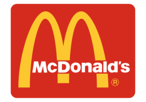
Known as the “Golden Arches,” the McDonald’s logo is instantly recognizable to people around the globe. The logo works on a few different levels, thanks to its innovative design.The golden “M” is meant to symbolize the name “McDonald’s,” but it works on a deeper level. Not only does the “M” play on the name of the company, it plays on everyone’s favorite McDonald’s side: their world-renowned french fries. The color and shape of the “M” make it appear to be made of french fries, delivering a double-meaning in one (or rather, two) fell swoops.
Tostitos
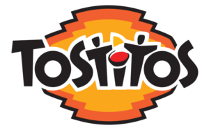
In 2003, America’s favorite tortilla chip company cleverly rebranded their logo. The two lowercase “T’s” were designed to look like stick figures, and the letter “I” is dotted with a small bowl of salsa. The two stick figures appear to hold a tortilla chip (seemingly a Tostitos chip) above the bowl of salsa, as if they’re fighting over who gets it. The two stick figures aren’t clearly visible at first - in fact, you’ll have to look past the word “Tostitos” itself to see the hidden characters. But when you do, you’ll have newfound respect for this Fiesta Bowl sponsor.
Amazon

Amazon’s logo doesn’t seem unique at first glance. The Sans-Serif representation of the company name seems oddly run-of-the-mill for such an innovative business. However, upon closer inspection the small green line below the word “Amazon” which makes this logo so unique. The curved green arrow in the Amazon logo stretches from the first “A” to the “Z,” as if to show Amazon sells products “from A to Z”. Furthermore, some speculate the arrow symbolizes a smile, because customers are going to smile when they shop from Amazon.
Nike

Nike’s logo is one of the most recognizable symbols in the world, but few know the hidden meaning and history behind the iconic swoosh. The Swoosh symbolizes a wing, like the winged Greek goddess of victory. Nike is synonymous with winning and success in athletics, making the logo a perfect fit for the brand.

Google is synonymous with innovation, and their logo is no exception. Each letter of the logo features a different primary color to bring about memories of childhood, but the true genius behind this logo lies in the letter “L.” While each other letter of the logo features a primary color, the “L” uses a secondary color to symbolize the unpredictability of the company. Few would argue against Google’s unpredictability, so their subtly innovative logo is a reflection of the company itself. What are some of your favorite logos of all time? What do you think makes a logo stand out? Tell us in the comments below!
Dive in