
Education Content
April 4, 2024
Logo Maker Tips: Logo Variations

# Logo Maker
# logo design
# logo
# branding
# professional branding
# graphic design
# graphics
The latest from the Logo Maker Team!

Hagit Marcus Bor
Hello Talented Sellers!
Today I want to talk about the variations we create for each logo.
The purpose of the variations is to give the buyers different color pallets, fonts and layouts for the logo he likes. Creating variations can be a lot of fun and it is easy to get caught in the moment and create color combinations that look nice and fun.
But we always have to come back to the purpose of the logo: to tell the brand story using a simple and memorable symbol, and to appeal to the target audience of the brand. While the visual decisions alone are very important, if they don’t represent a brand personality and the industry that it belongs to, chances are the logo won’t appeal to buyers.
So, before we start creating variations, we have to decide what industry or industries we want to tag the logo, and ask ourselves the following questions:
- Which colors fit the industry characteristics?
- Do the colors fit the target audience expectations from the brand?
- Are the colors we chose suitable for a website/business card/ storefront / label?
Often we believe a logo fits several industries, and sometimes those industries require different color combinations. If that's the case, we need to ask ourselves: Does the logo really fit all of those industries or are we just pushing it? 🙂
To demonstrate, let's take a look at three very different industries and examine what colors fit them and what colors don’t.
Let's start:
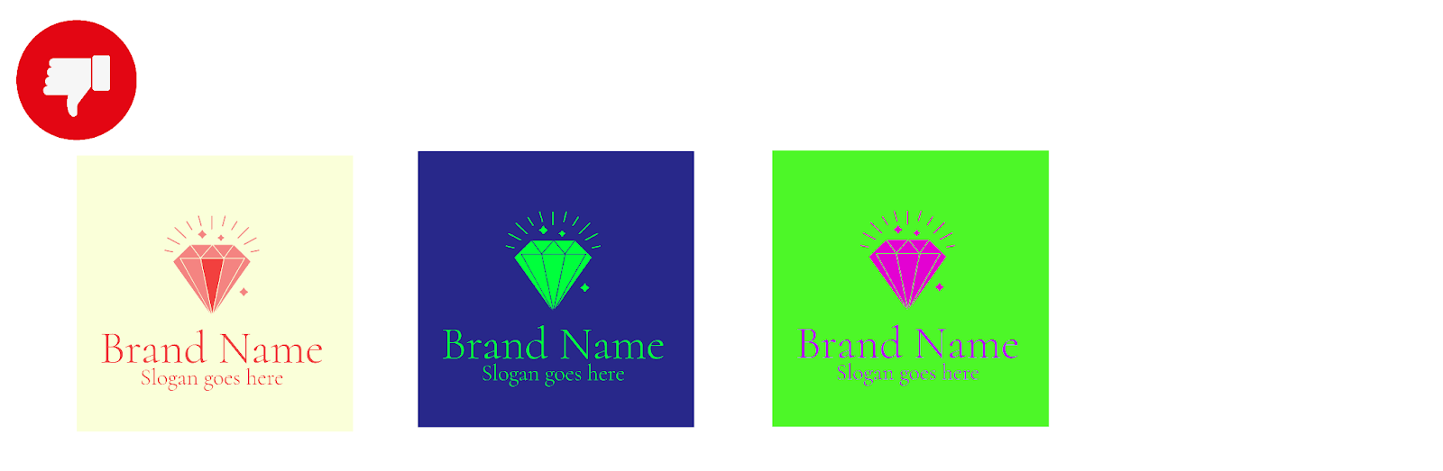
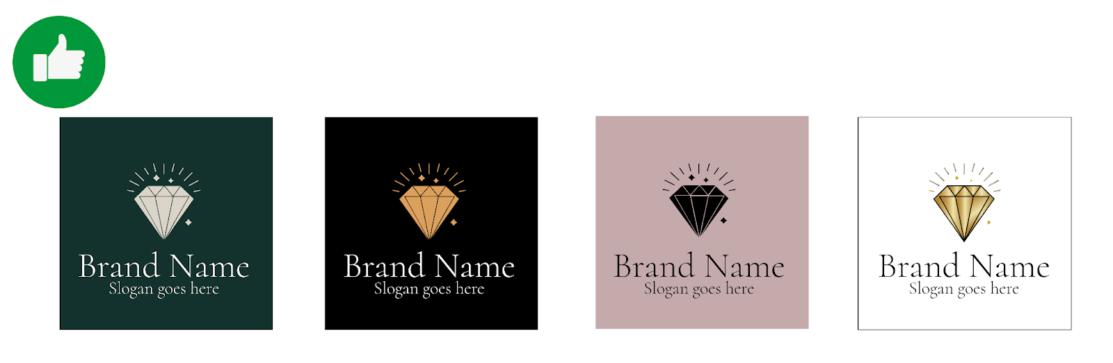
1. Jewelry Industry:
When designing a logo for the jewelry industry, luxury, exclusivity, and emotional significance are key. Audience expectations include quality craftsmanship, sophistication, and a memorable brand experience.
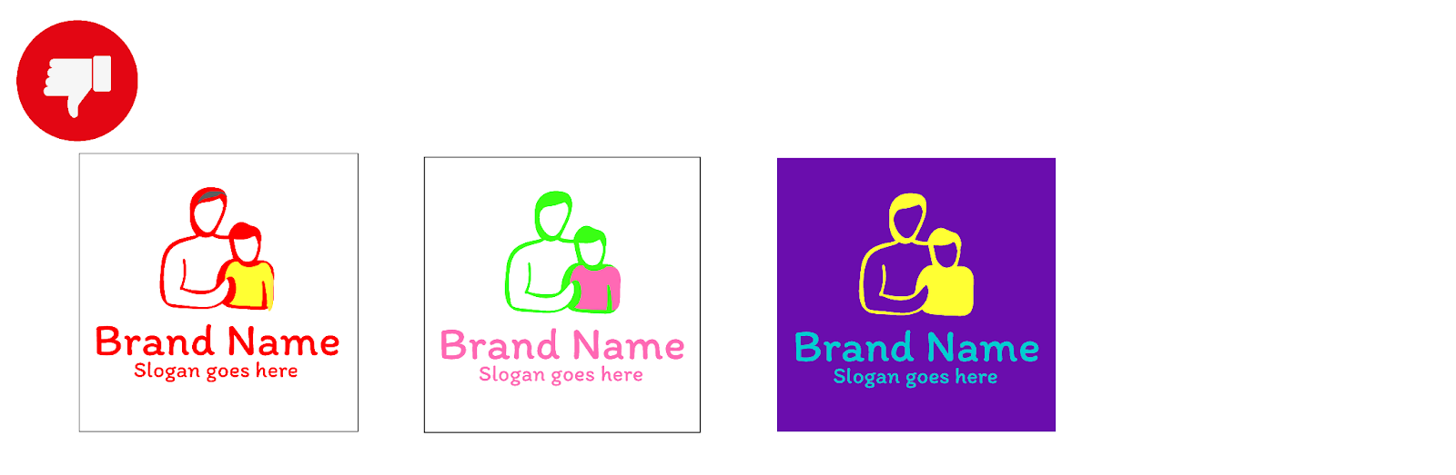
Bad Color Combinations:
- Bright, neon colors or overly vibrant combinations might come off as cheap or tacky in the context of high-end jewelry brands.
- Two light colors together would not work well. They often don’t have the luxurious touch needed in jewelry brands.
- Colors that are side by side on the color wheel such as green and blue won’t work for the jewelry industry either as they often seem disharmonious.
Good Color Combinations:
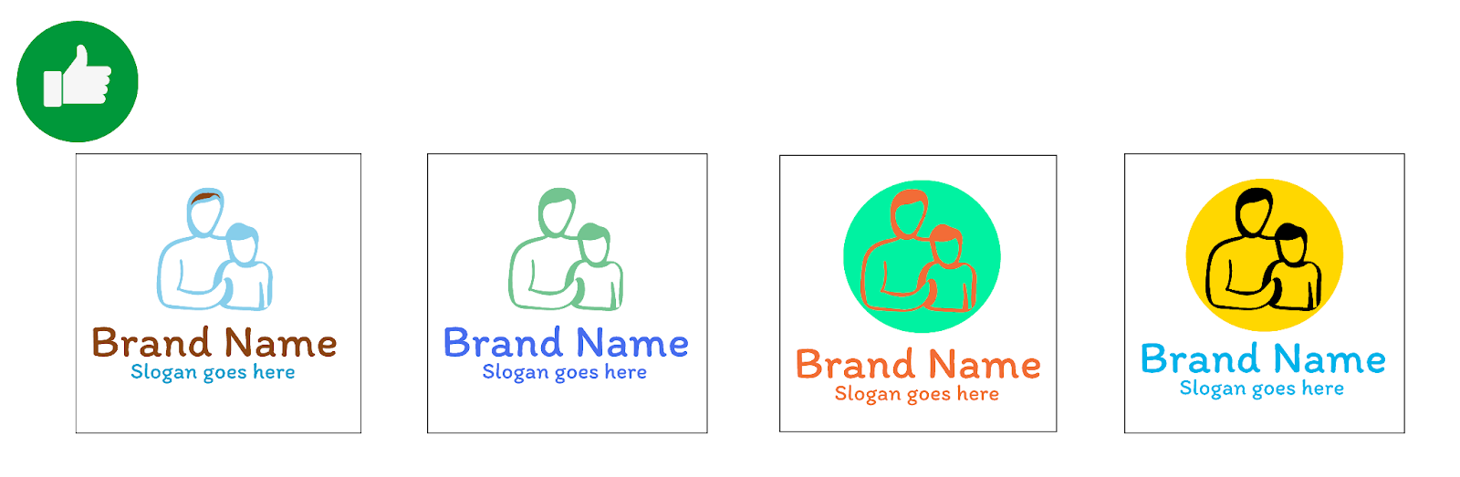
- Elegant and luxurious colors such as gold, silver, black, often work well for jewelry brands. These colors convey sophistication, quality, and exclusivity.
- Soft colors and tones convery elegance and style, and give the brand a feminine touch Contrast between the logo and background is important for legibility and visual impact. For example, a gold logo on a dark background or a silver logo on a black background can create a striking effect.Background Color Considerations.
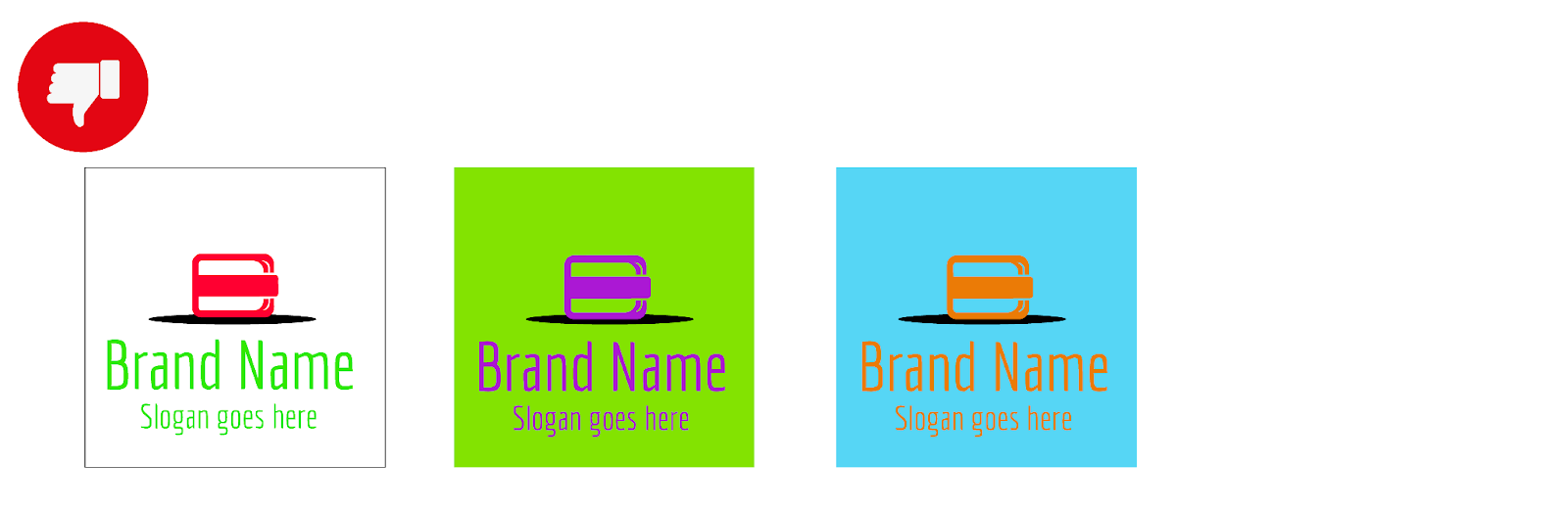
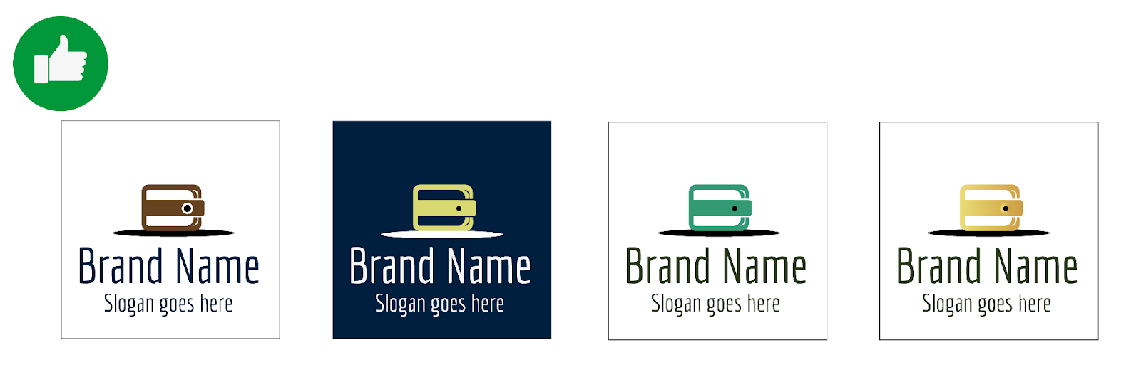
2. Financial & Business Services Industries:
When designing a logo for the financial & business industry, trust, stability, and professionalism are paramount. Audience expectations include security, transparency, and professionalism.
Bad Color Combinations:
- Bright, flashy colors might undermine the seriousness and reliability that financial institutions aim to convey.
- Overly playful or unconventional color combinations might erode trust and credibility.
Good Color Combinations:
- Traditional and conservative colors like navy blue, dark green, and charcoal gray are often preferred in the financial sector as they convey stability, trustworthiness, and professionalism.
- Contrasting colors with high visibility can enhance readability and make the logo stand out effectively.
- Light backgrounds offer a clean canvas for the logo to shine while maintaining a sense of seriousness and stability.
3. Non-profit Industry:
When designing a logo for the non-profit industry, mission-driven and community engagement are central themes. Audience expectations include social impact, transparency, and emotional connection. Background colors should evoke compassion and trust.
bad Color Combinations:
- Harsh or aggressive color combinations might convey the wrong message and alienate potential supporters or donors.
- Colors that are too somber or gloomy might fail to inspire action or engagement.
Good Color Combinations:
- Warm and inviting colors like soft blues, greens, and earthy tones can evoke feelings of compassion, hope, and solidarity, which are often associated with non-profit organizations.
- Harmonious color schemes that reflect the organization's mission and values can foster connection and empathy with the audience.
- Soft, muted backgrounds such as pastel blues, greens, or warm grays provide a calming and reassuring backdrop for non-profit logos. These colors evoke feelings of compassion and harmony, fostering a sense of trust and empathy with the audience.
A few extra tips about variations:
- Avoid placing the slogan on top of the brand name. The brand name is the name of the business and the slogan is the explanation of the essence of the business. As such, the slogan always comes after the brand name and completes it.
- Make sure there is a proper hierarchy between the symbol and the brand name + slogan.
- We create all variations side by side and so it sometimes feels like a series of images.
We need to remember that the chosen variation will stand alone after its purchase. Treat each variation as if it is the chosen one.
I hope you found this information helpful! Now I want to ask you:
When creating variations, what is your process?
Do you play freestyle and just have fun with it?
Do you have a ready made color palette combinations? What about fonts? Do you have a list of fonts that matches each industry?
Share your process in the comments!
Comment (1)
Popular

Popular
Dive in
Related
Blog
Playful or Serious Logo? Tips from the Logo Maker Team
By Hagit Marcus Bor • Sep 17th, 2024 • Views 226
Blog
Playful or Serious Logo? Tips from the Logo Maker Team
By Hagit Marcus Bor • Sep 17th, 2024 • Views 226